TekX by Tekgeminus
My Role
Team Members
Tools Used
Timeline
Background
The Challenge
Information Architecture
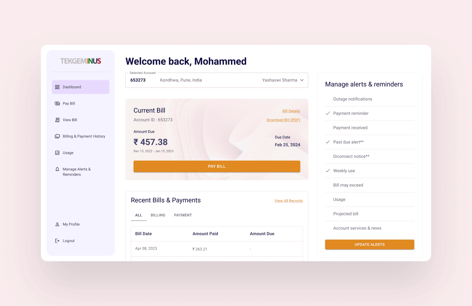
Tekgeminus is a global digital transformation company specializing in cloud infrastructures, data science, and industry-specific platforms. With strategic alliances and certified expertise, the company delivers scalable, resilient solutions that improve business performance. One of its flagship products, TekX, simplifies utility management by enabling customers to view bills, track usage, and make instant payments. Designed to reduce operational costs and boost satisfaction, TekX empowers utilities with efficiency and a superior customer experience.
As the Lead UI/UX Designer, I drove the information architecture and user flow design for TekX, ensuring clarity and usability across the product. I collaborated with clients to align business needs with user-centered design, while also mentoring a junior designer in the two-member team. My role spanned from creating intuitive layouts to validating user journeys, balancing aesthetics with functionality. This project demonstrated my ability to lead design strategy and deliver a scalable, customer-first digital solution.
Research & Exploring the Structure
User interviews were conducted by the core team in Tennessee. While I wasn't present for the sessions, I synthesised the findings with the team to align on which workflows were essential for mobile and which were better suited to remain on desktop. This conversation became the foundation for every structural decision that followed.
With the scope defined, three structural approaches were explored:

Assessments, sessions, and goals as separate destinations linked by session IDs. Familiar, but required jumping across sections to complete one task.

Navigation simplified, bottom nav removed, but the three still lived independently. Less clutter, same fragmentation.

Everything was organised within the session itself. One entry point, one context, no jumping between sections.
Option 3 was chosen because it matched how patients naturally think about their care: in terms of sessions, not categories. If a patient wants to do anything related to one session, they go there and nowhere else. It also clarified the mobile scope — the session was the sole task we wanted to support on mobile. Everything else that felt too complex was intentionally left on desktop.
Interactive Prototype
TekX by Tekgeminus
My Role
Team Members
Tools Used
Timeline
Background
The Challenge
Information Architecture
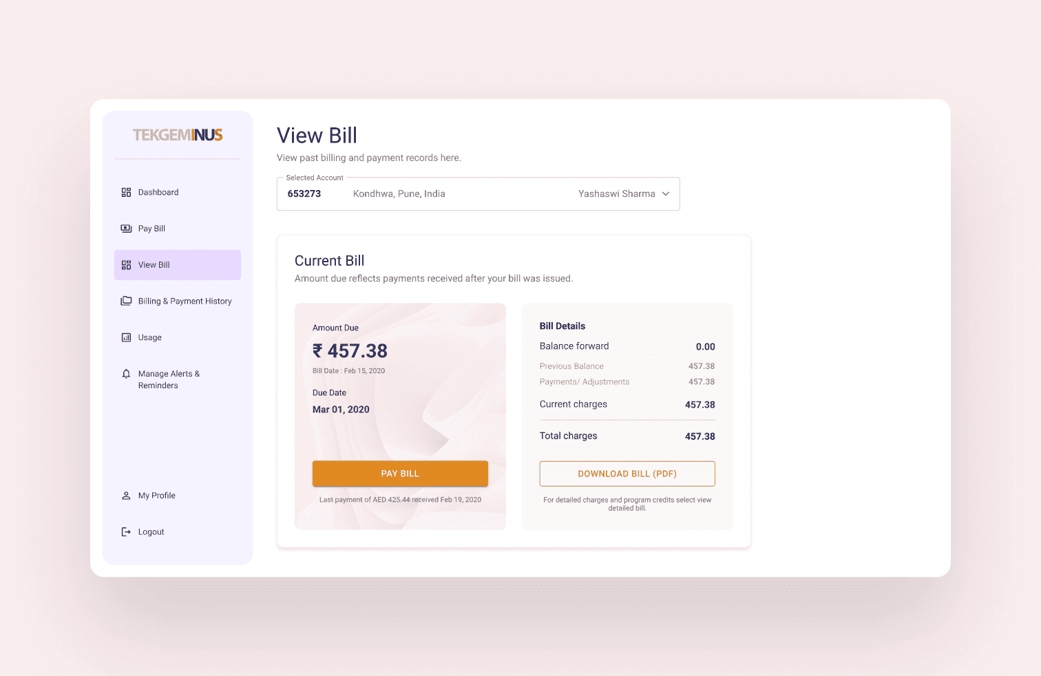
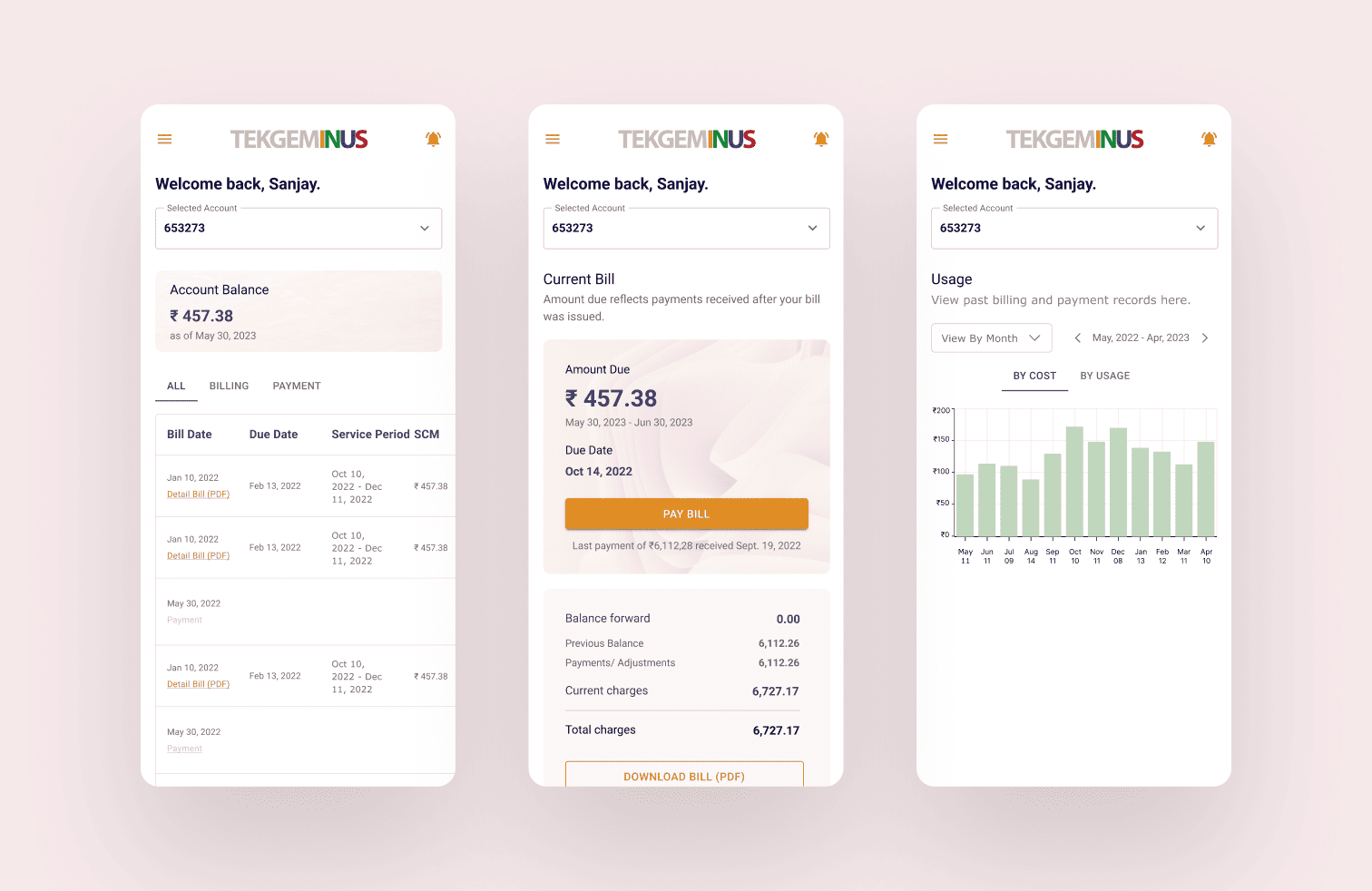
Tekgeminus is a global digital transformation company specializing in cloud infrastructures, data science, and industry-specific platforms. With strategic alliances and certified expertise, the company delivers scalable, resilient solutions that improve business performance. One of its flagship products, TekX, simplifies utility management by enabling customers to view bills, track usage, and make instant payments. Designed to reduce operational costs and boost satisfaction, TekX empowers utilities with efficiency and a superior customer experience.
As the Lead UI/UX Designer, I drove the information architecture and user flow design for TekX, ensuring clarity and usability across the product. I collaborated with clients to align business needs with user-centered design, while also mentoring a junior designer in the two-member team. My role spanned from creating intuitive layouts to validating user journeys, balancing aesthetics with functionality. This project demonstrated my ability to lead design strategy and deliver a scalable, customer-first digital solution.
Research & Exploring the Structure
User interviews were conducted by the core team in Tennessee. While I wasn't present for the sessions, I synthesised the findings with the team to align on which workflows were essential for mobile and which were better suited to remain on desktop. This conversation became the foundation for every structural decision that followed.
With the scope defined, three structural approaches were explored:
Assessments, sessions, and goals as separate destinations linked by session IDs. Familiar, but required jumping across sections to complete one task.
Navigation simplified, bottom nav removed, but the three still lived independently. Less clutter, same fragmentation.
Everything was organised within the session itself. One entry point, one context, no jumping between sections.
Option 3 was chosen because it matched how patients naturally think about their care: in terms of sessions, not categories. If a patient wants to do anything related to one session, they go there and nowhere else. It also clarified the mobile scope — the session was the sole task we wanted to support on mobile. Everything else that felt too complex was intentionally left on desktop.
Interactive Prototype