
QA Automation
My Role
Team Members
Tools Used
Timeline
Background
The Challenge
Information Architecture
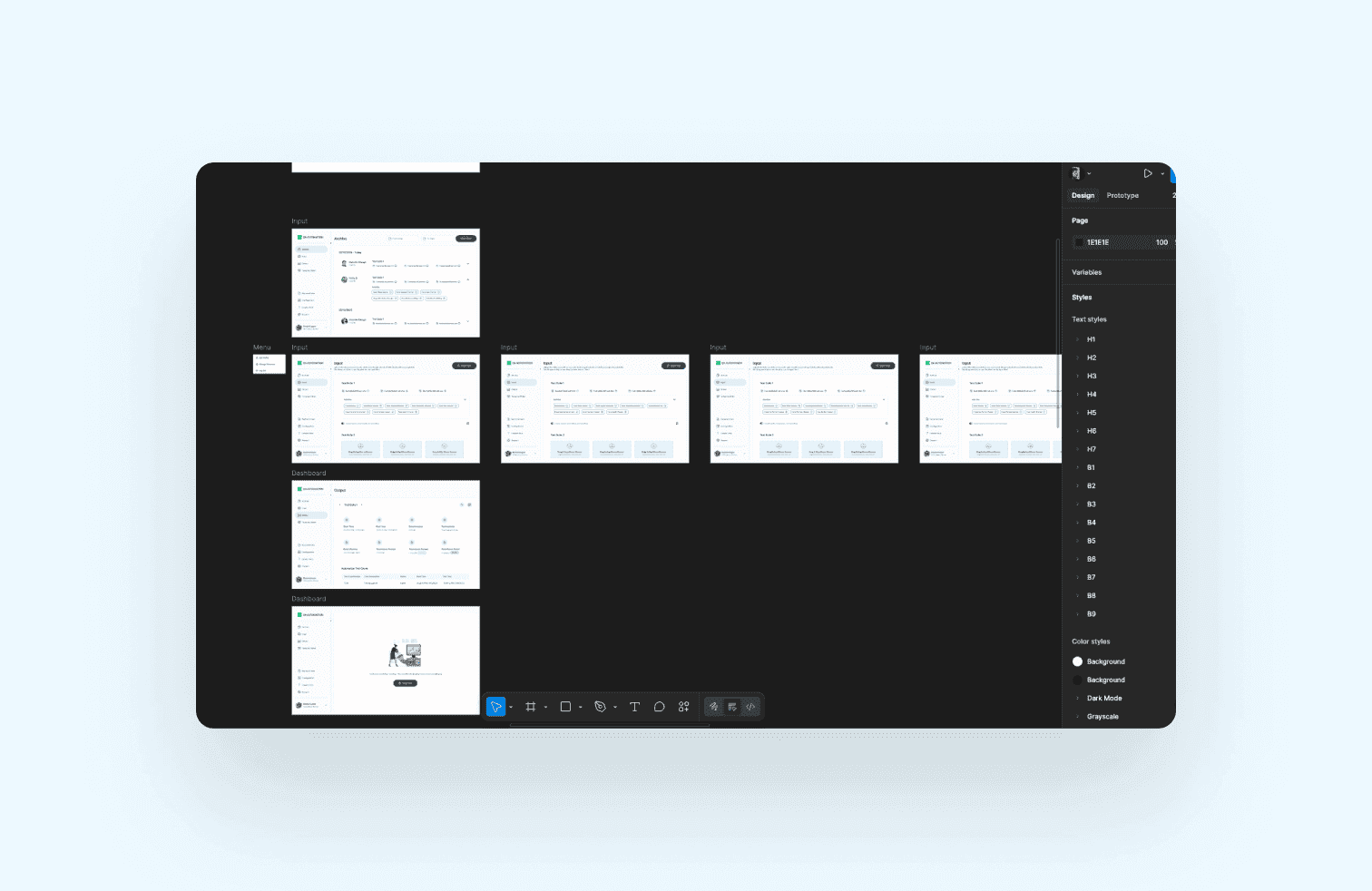
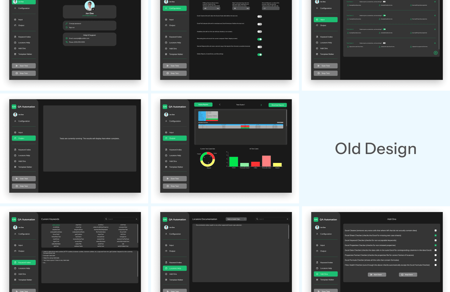
QA Automation is an internal platform designed to streamline Excel-based test suites for greater efficiency. It enables users to upload, configure, and run automated checks on spreadsheets through predefined test suites and add-ons. While the tool already had strong functionality and user flows, its interface lacked clarity and consistency. Navigating sections like Input, Output, Template Maker, and Archive often felt cluttered and overwhelming.
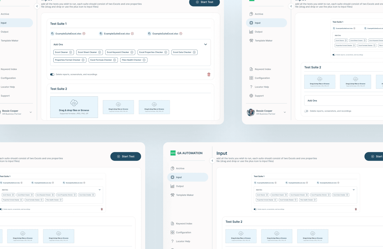
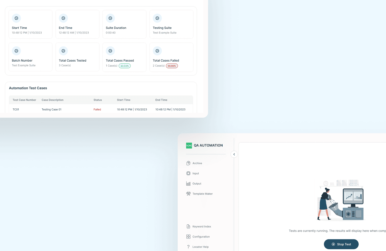
I was brought in to revamp the visual design of the application, focusing on layout, hierarchy, and visual balance. My role involved applying consistent spacing, refining styles, and leveraging brand colors to bring cohesion to the interface. I ensured the design remained intuitive and minimal while preserving the original UX flows. The end result was a cleaner, more professional interface that improved usability without disrupting existing workflows.
Research & Exploring the Structure
User interviews were conducted by the core team in Tennessee. While I wasn't present for the sessions, I synthesised the findings with the team to align on which workflows were essential for mobile and which were better suited to remain on desktop. This conversation became the foundation for every structural decision that followed.
With the scope defined, three structural approaches were explored:

Assessments, sessions, and goals as separate destinations linked by session IDs. Familiar, but required jumping across sections to complete one task.

Navigation simplified, bottom nav removed, but the three still lived independently. Less clutter, same fragmentation.

Everything was organised within the session itself. One entry point, one context, no jumping between sections.
Option 3 was chosen because it matched how patients naturally think about their care: in terms of sessions, not categories. If a patient wants to do anything related to one session, they go there and nowhere else. It also clarified the mobile scope — the session was the sole task we wanted to support on mobile. Everything else that felt too complex was intentionally left on desktop.
Interactive Prototype
QA Automation
My Role
Team Members
Tools Used
Timeline
Background
The Challenge
Information Architecture
QA Automation is an internal platform designed to streamline Excel-based test suites for greater efficiency. It enables users to upload, configure, and run automated checks on spreadsheets through predefined test suites and add-ons. While the tool already had strong functionality and user flows, its interface lacked clarity and consistency. Navigating sections like Input, Output, Template Maker, and Archive often felt cluttered and overwhelming.
I was brought in to revamp the visual design of the application, focusing on layout, hierarchy, and visual balance. My role involved applying consistent spacing, refining styles, and leveraging brand colors to bring cohesion to the interface. I ensured the design remained intuitive and minimal while preserving the original UX flows. The end result was a cleaner, more professional interface that improved usability without disrupting existing workflows.
Research & Exploring the Structure
User interviews were conducted by the core team in Tennessee. While I wasn't present for the sessions, I synthesised the findings with the team to align on which workflows were essential for mobile and which were better suited to remain on desktop. This conversation became the foundation for every structural decision that followed.
With the scope defined, three structural approaches were explored:
Assessments, sessions, and goals as separate destinations linked by session IDs. Familiar, but required jumping across sections to complete one task.
Navigation simplified, bottom nav removed, but the three still lived independently. Less clutter, same fragmentation.
Everything was organised within the session itself. One entry point, one context, no jumping between sections.
Option 3 was chosen because it matched how patients naturally think about their care: in terms of sessions, not categories. If a patient wants to do anything related to one session, they go there and nowhere else. It also clarified the mobile scope — the session was the sole task we wanted to support on mobile. Everything else that felt too complex was intentionally left on desktop.
Interactive Prototype