Miter Health
My Role
Team Members
Tools Used
Timeline
Background
The Challenge
Information Architecture
Miter Health is committed to transforming eldercare by addressing the challenges home healthcare providers face—from rising costs to compliance issues and staff productivity. Their integrated care solution automates manual processes, streamlines workflows, and ensures facilities remain compliant with regulations. By offering real-time data access, billing management, and staff efficiency tools, Miter Health helps care providers deliver consistent, high-quality patient experiences. With a secure and tailored ecosystem, the platform builds trust between patients, families, and healthcare staff.
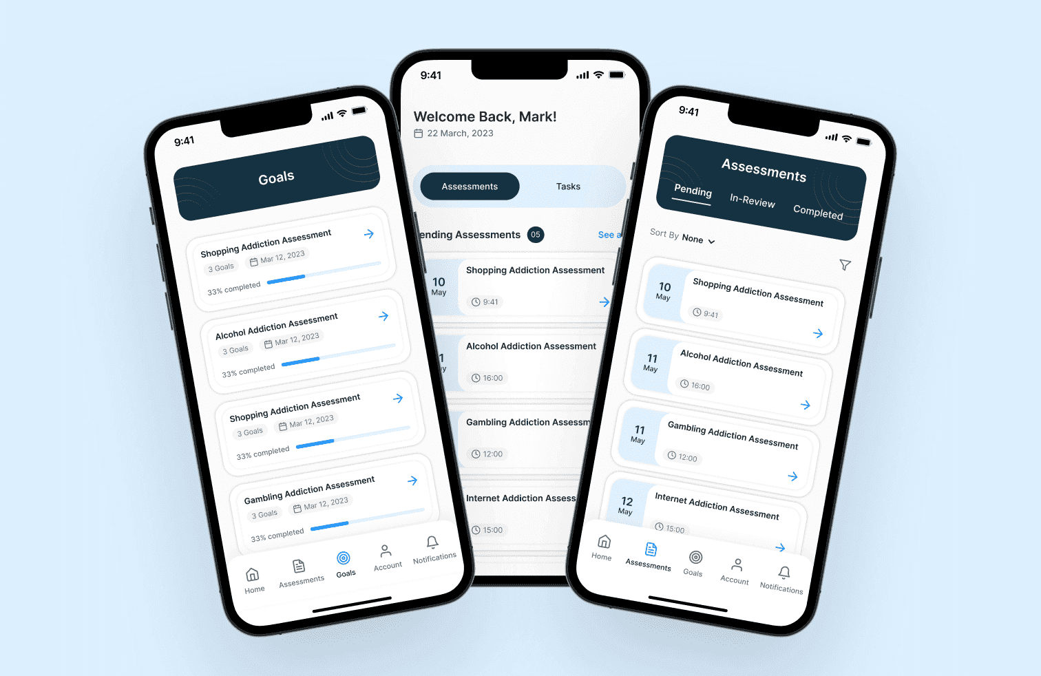
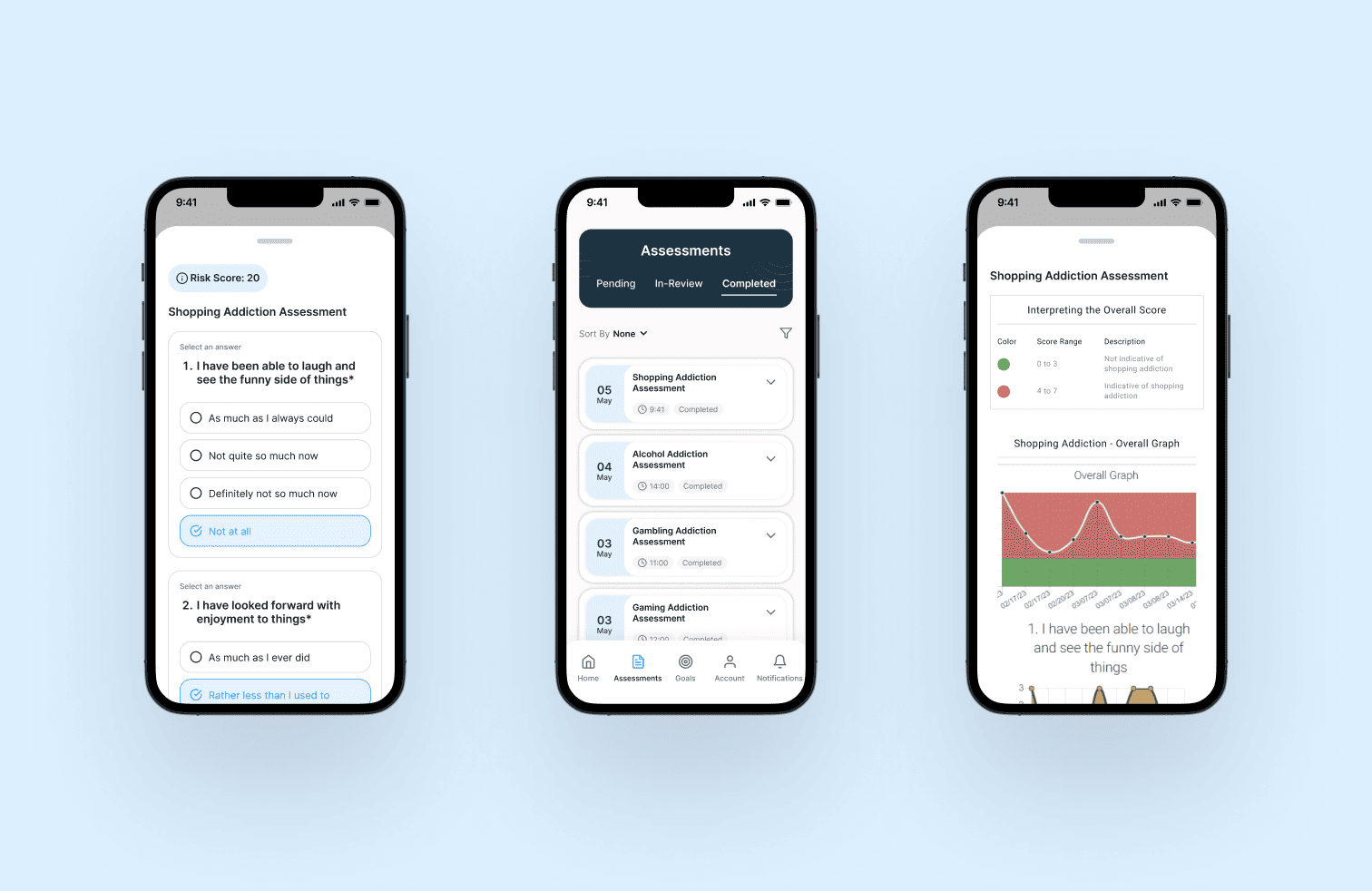
For this project, I was responsible for designing both the website and mobile application to reflect the brand’s mission of simplifying eldercare. My focus was on creating intuitive user flows that make complex data accessible, while ensuring the interface feels professional and trustworthy. By translating healthcare needs into a clean, functional digital experience, I helped Miter Health present its platform as both reliable and innovative.
Research & Exploring the Structure
User interviews were conducted by the core team in Tennessee. While I wasn't present for the sessions, I synthesised the findings with the team to align on which workflows were essential for mobile and which were better suited to remain on desktop. This conversation became the foundation for every structural decision that followed.
With the scope defined, three structural approaches were explored:

Assessments, sessions, and goals as separate destinations linked by session IDs. Familiar, but required jumping across sections to complete one task.

Navigation simplified, bottom nav removed, but the three still lived independently. Less clutter, same fragmentation.

Everything was organised within the session itself. One entry point, one context, no jumping between sections.
Option 3 was chosen because it matched how patients naturally think about their care: in terms of sessions, not categories. If a patient wants to do anything related to one session, they go there and nowhere else. It also clarified the mobile scope — the session was the sole task we wanted to support on mobile. Everything else that felt too complex was intentionally left on desktop.
Interactive Prototype
Miter Health
My Role
Team Members
Tools Used
Timeline
Background
The Challenge
Information Architecture
Miter Health is committed to transforming eldercare by addressing the challenges home healthcare providers face—from rising costs to compliance issues and staff productivity. Their integrated care solution automates manual processes, streamlines workflows, and ensures facilities remain compliant with regulations. By offering real-time data access, billing management, and staff efficiency tools, Miter Health helps care providers deliver consistent, high-quality patient experiences. With a secure and tailored ecosystem, the platform builds trust between patients, families, and healthcare staff.
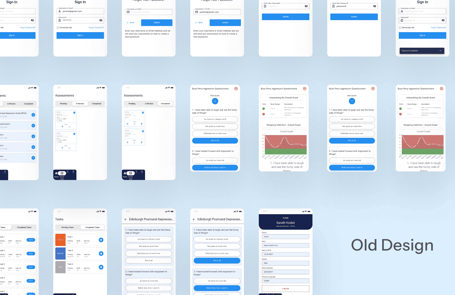
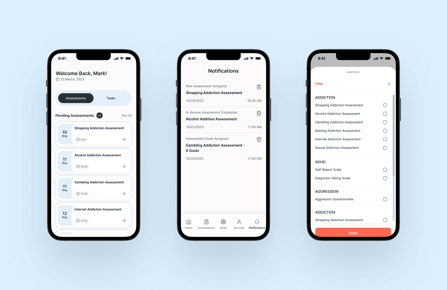
For this project, I was responsible for designing both the website and mobile application to reflect the brand’s mission of simplifying eldercare. My focus was on creating intuitive user flows that make complex data accessible, while ensuring the interface feels professional and trustworthy. By translating healthcare needs into a clean, functional digital experience, I helped Miter Health present its platform as both reliable and innovative.
Research & Exploring the Structure
User interviews were conducted by the core team in Tennessee. While I wasn't present for the sessions, I synthesised the findings with the team to align on which workflows were essential for mobile and which were better suited to remain on desktop. This conversation became the foundation for every structural decision that followed.
With the scope defined, three structural approaches were explored:
Assessments, sessions, and goals as separate destinations linked by session IDs. Familiar, but required jumping across sections to complete one task.
Navigation simplified, bottom nav removed, but the three still lived independently. Less clutter, same fragmentation.
Everything was organised within the session itself. One entry point, one context, no jumping between sections.
Option 3 was chosen because it matched how patients naturally think about their care: in terms of sessions, not categories. If a patient wants to do anything related to one session, they go there and nowhere else. It also clarified the mobile scope — the session was the sole task we wanted to support on mobile. Everything else that felt too complex was intentionally left on desktop.
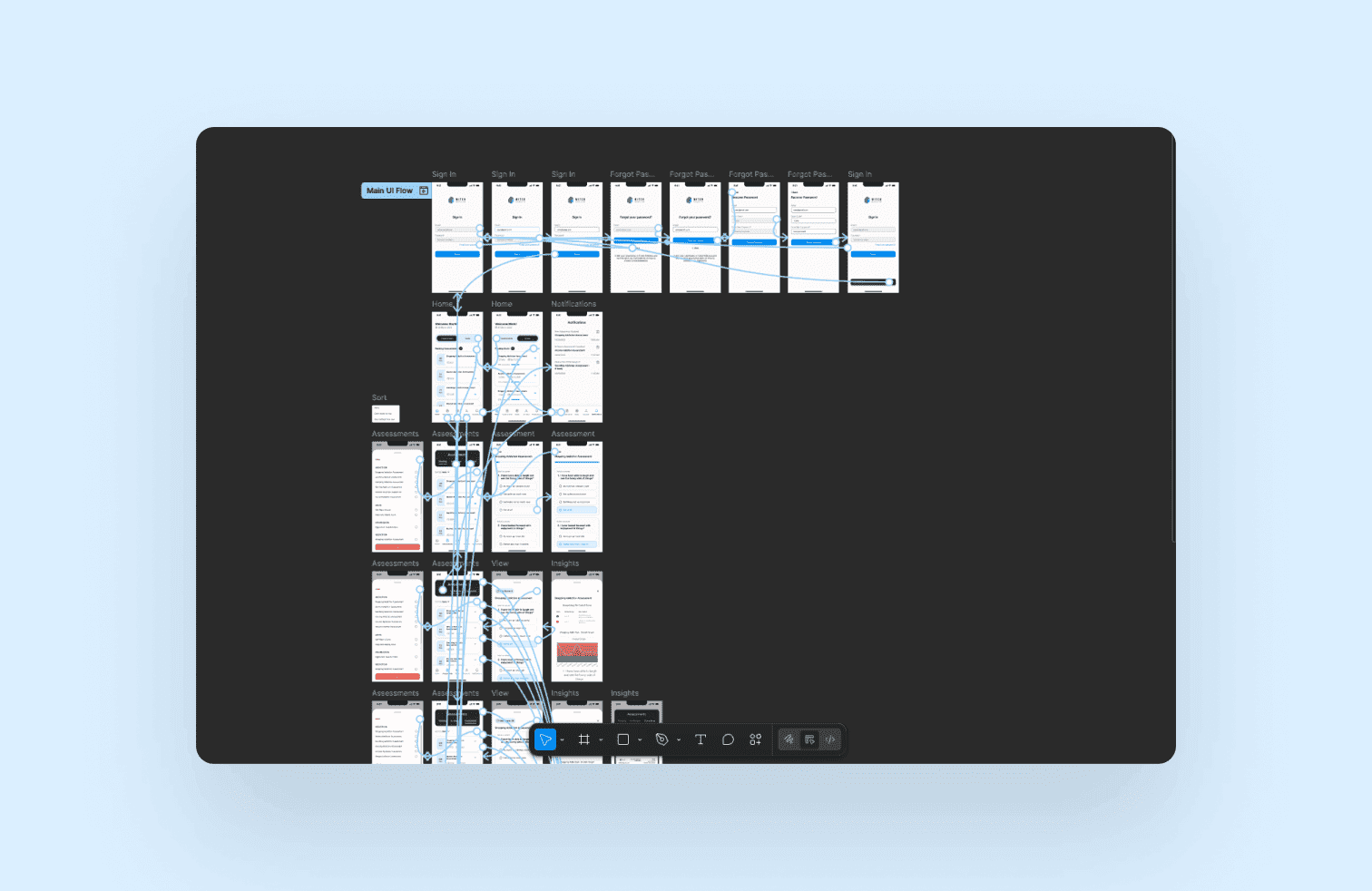
Interactive Prototype