Anara
Background
The Challenge
Information Architecture
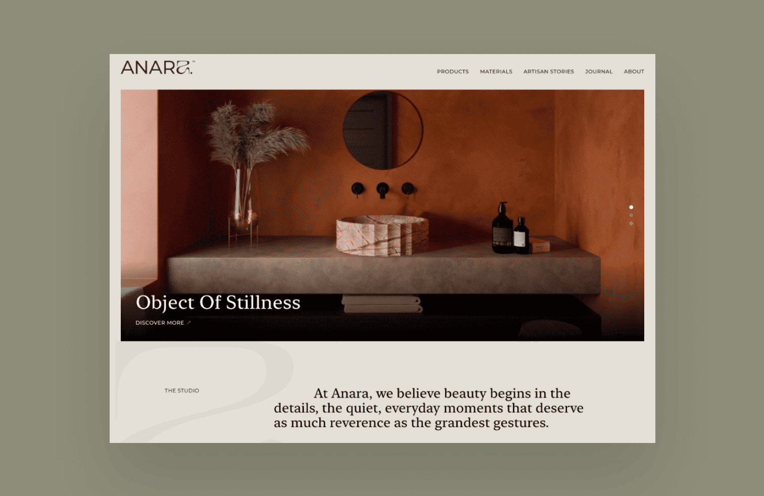
Anara redefines everyday living by transforming the basin into a vessel of stillness and meaning. Each piece is handcrafted in India using natural materials, blending artistry with functionality. The brand’s philosophy centers on creating soulful designs that anchor spaces with elegance and intention. By merging craft with contemplation, Anara offers timeless products that elevate both home and lifestyle experiences.
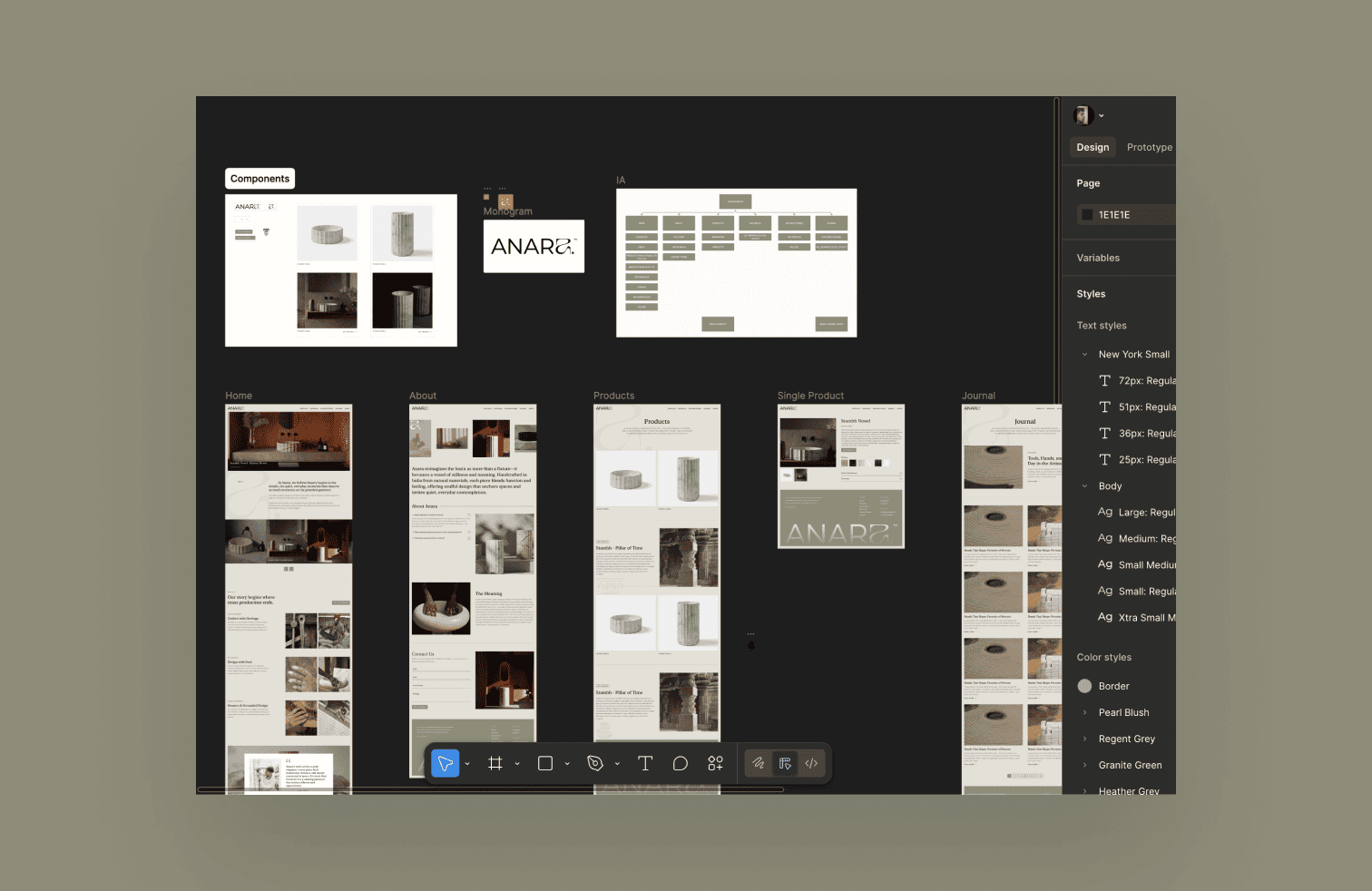
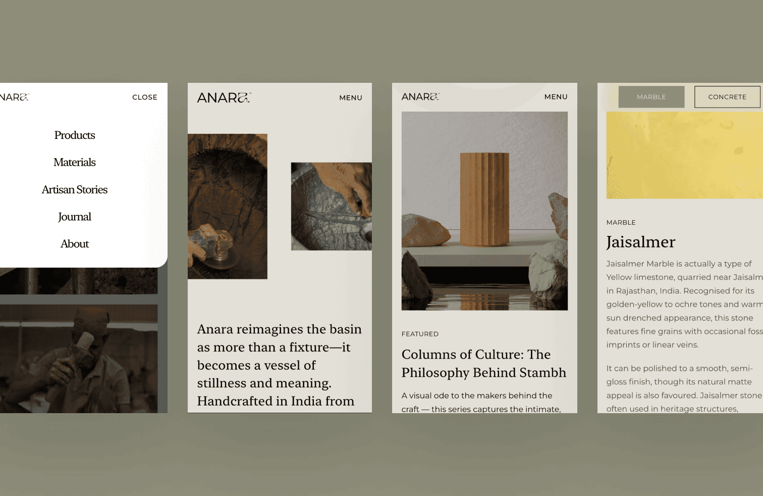
As the UI/UX Designer and Developer, I designed and developed Anara’s website entirely from scratch. Using Figma for design and Framer for development, I translated the brand’s philosophy into a minimal yet immersive digital experience. My role involved building intuitive navigation, responsive layouts, and seamless interactions to highlight the handcrafted artistry. The project reflects my ability to fuse design storytelling with technical execution, delivering a website that embodies the brand’s essence.
Research & Exploring the Structure
User interviews were conducted by the core team in Tennessee. While I wasn't present for the sessions, I synthesised the findings with the team to align on which workflows were essential for mobile and which were better suited to remain on desktop. This conversation became the foundation for every structural decision that followed.
With the scope defined, three structural approaches were explored:

Assessments, sessions, and goals as separate destinations linked by session IDs. Familiar, but required jumping across sections to complete one task.

Navigation simplified, bottom nav removed, but the three still lived independently. Less clutter, same fragmentation.

Everything was organised within the session itself. One entry point, one context, no jumping between sections.
Option 3 was chosen because it matched how patients naturally think about their care: in terms of sessions, not categories. If a patient wants to do anything related to one session, they go there and nowhere else. It also clarified the mobile scope — the session was the sole task we wanted to support on mobile. Everything else that felt too complex was intentionally left on desktop.
Interactive Prototype

Anara
Background
The Challenge
Information Architecture
Anara redefines everyday living by transforming the basin into a vessel of stillness and meaning. Each piece is handcrafted in India using natural materials, blending artistry with functionality. The brand’s philosophy centers on creating soulful designs that anchor spaces with elegance and intention. By merging craft with contemplation, Anara offers timeless products that elevate both home and lifestyle experiences.
As the UI/UX Designer and Developer, I designed and developed Anara’s website entirely from scratch. Using Figma for design and Framer for development, I translated the brand’s philosophy into a minimal yet immersive digital experience. My role involved building intuitive navigation, responsive layouts, and seamless interactions to highlight the handcrafted artistry. The project reflects my ability to fuse design storytelling with technical execution, delivering a website that embodies the brand’s essence.
Research & Exploring the Structure
User interviews were conducted by the core team in Tennessee. While I wasn't present for the sessions, I synthesised the findings with the team to align on which workflows were essential for mobile and which were better suited to remain on desktop. This conversation became the foundation for every structural decision that followed.
With the scope defined, three structural approaches were explored:
Assessments, sessions, and goals as separate destinations linked by session IDs. Familiar, but required jumping across sections to complete one task.
Navigation simplified, bottom nav removed, but the three still lived independently. Less clutter, same fragmentation.
Everything was organised within the session itself. One entry point, one context, no jumping between sections.
Option 3 was chosen because it matched how patients naturally think about their care: in terms of sessions, not categories. If a patient wants to do anything related to one session, they go there and nowhere else. It also clarified the mobile scope — the session was the sole task we wanted to support on mobile. Everything else that felt too complex was intentionally left on desktop.
Interactive Prototype